
Student journalism within the Columbia community, reimagined for a comfortable mobile reading experience.
June - September 2022
Principle Product Designer, Product Manager
P. Wu, B. Yang, M. Guo, and with support from the rest of the Spectator Product Team
As one of Columbia’s largest student-run media groups, the Columbia Daily Spectator has historically only been accessible on web browsers. In order to create a more accessible platform for a campus that prefers to read on mobile and versatile experiences for creative and interactive journalism, Spectator is a mobile app that strives to do just that.


The Columbia Daily Spectator delivers news daily to thousands of readers around Columbia University and surrounding communities. It is the second oldest college daily paper in the country and has been financially independent from the University since 1962.
Spectator's sections were growing to be more diverse every year. With teams that worked on podcasts, interactive storytelling, and crosswords, we were always looking for platforms that made multi-media more accessible and interesting.
We wanted features that helped readers build a stronger sense of identity and connection to the content. Plans to achieve this included personalized push notifications settings, as well as saving and sharing functionalities.
Working with different businesses near campus, Spectator was always searching for different ways to integrate client-generated content seamlessly into student journalism.

We also analyzed existing mobile applications from a range of established publications and university media groups in order to specify relevant features and design decisions that we should prioritize.
Ultimately, our demand research helped us gain more clarity on 3 aspects: modular components for article layout formatting, categorization by tags/subtags, and personalized sharing/saving functionality.
See my design process and iterations for each part detailed below.
Through the previous few iterations, I explored how we could most effectively lay out each day’s top articles and recent work by each section on the screen. I wanted to use a layout where users could scroll sideways and click on cards for top articles or sub-sections, and initially wanted to include this design under each section on the home page for sub-section pages.

The home page needed to be more than simply another amalgamation of different sections. I wanted to prioritize the "Top Stories" portion of the screen, and having individual cards for other sections distracted the user with too many visual card components. As such, I opted to only use the card design for top articles in order to grasp more attention.
These designs were also made with the intention of expanding the home screen to more personalized content in future versions.


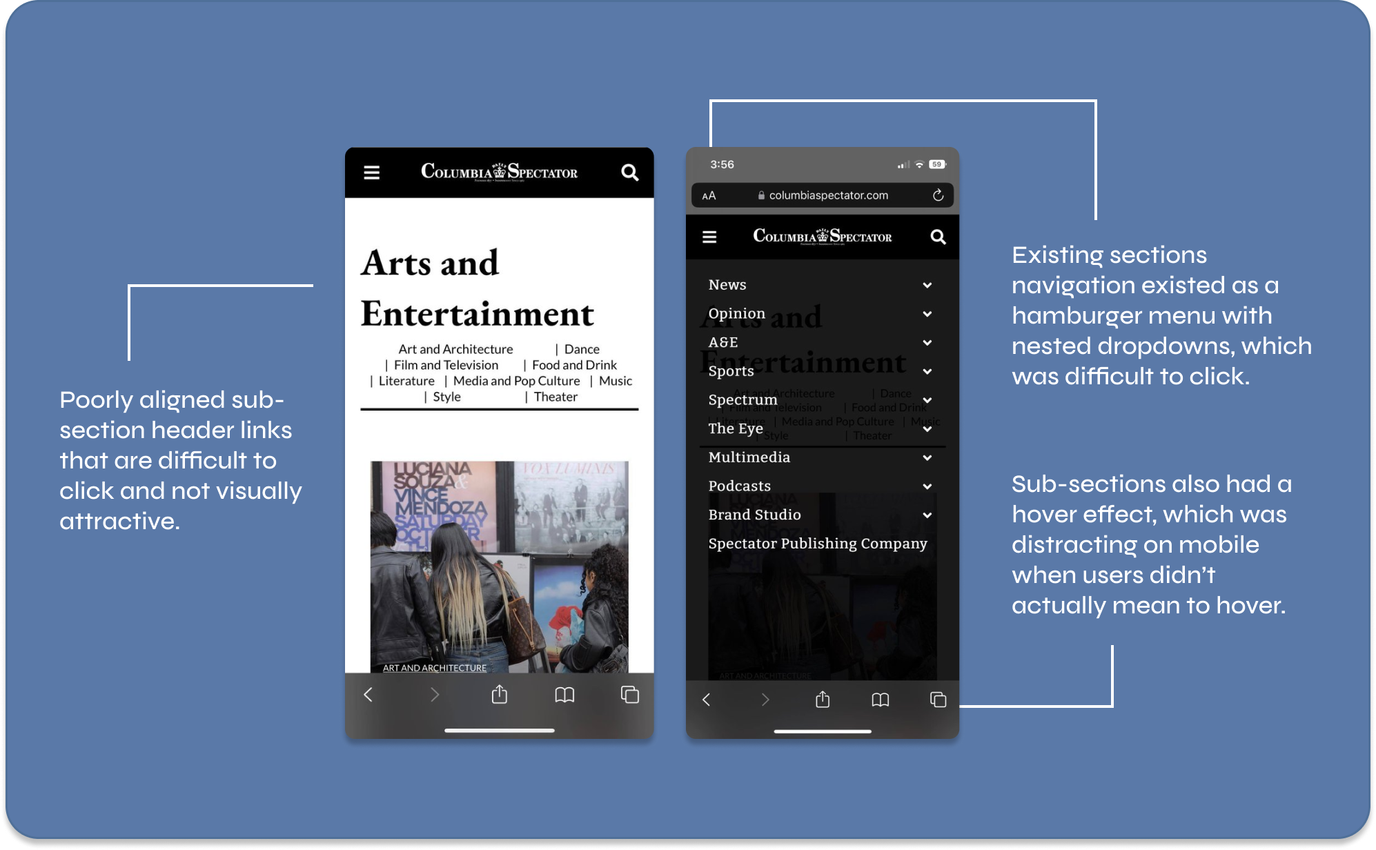
The goal of sections was twofold: organizing content by section in an easy-to-access manner, as well as highlighting the different subsections within each section. To begin, I prototyped a few different approaches.


I ended up designing a simple third iteration that used cards to display subsections, aiming to also draw attention to these options through the visual nature of the cards. I also designed a distinct page for subsections that laid articles out in a simple list.


Although I opted to use a simple single-column layout for most of the article’s body text, I tested the other options when deciding how to lay out related articles at the end of the article for reader engagement.
Ultimately, the app needed something that was easy to build upon, as we would pivot to designing for more diverse types of content in future iterations.


In order to start building personalized features that would improve the readers' experience beyond the existing web platforms, I started by introducing saved articles and personalized settings, which include display adjustments and push notification preferences.


I decided to use the search menu as an opportunity to include the section tags that I designed. On top of searching for key words in article titles, the “sections” function also allows the user to search by relevant section or sub-section tags.Although I considered additional features such as ‘most searched this week,’ I decided to keep things simple for the first iteration.


Throughout this process, I was also able to experiment with multiple article layouts. Ultimately, I ended up rejecting one of the article layouts I created after realizing that the image alignment created a rift in a user’s F-shaped reading patterns. Instead, I opted to re-align the image on the right for a smoother experience.
I also designed a series of consistent elements to be used as navbars, toggle buttons, and popups. Through these components, I was also able to create clickable prototypes with more ease, as I learned to directly animate components. Additionally, I received direct feedback from the engineers at Spectator that the system made converting designs to real code much more manageable.
Before shipping our designs off to our engineering team, we shared our designs with 11 other staff members from Spectator’s various sections. Here’s what some of them had to say after reviewing our designs:
In most cases, people preferred the cleaner and simpler designs, such as the plain-word section tag over the one that would be enclosed in box.
More people liked for the “Profile” option as opposed to the “settings” option in the nav bar. This way, we would also create opportunities for more account personalization in later version updates.
It's important to consider ad space! Fortunately, we had baked in placeholders for potential ads.
Adding more graphic elements like the cards were nice, but it was important that we reserved them for more important elements that may have been less discoverable on the website.
It was good that we did not try to implement too many visual-design heavy unique elements for the initial version, especially for Engineering’s sake.
This is only the first iteration! Moving forward, we plan on designing features and pages for special sections at Spectator that better adhere to the purpose and identity of the work, interactive functions for quizzes and crosswords, and podcasts and video content.
I found it a little mentally taxing at times to remain loyal to Spectator’s visual identity while bringing new features to the mobile interface. It would be easy to go crazy and design something completely new with no limits in mind, but this project forced me to think carefully about every decision.
I had so many ideas for visual or interactive elements heading into the project, but had to be really cognizant of what was feasible the first time around and what wasn’t.
While designing these mockups, I spent more time designing subtle interactions while using components for consistency. I’ve come to appreciate an animated prototype much more and have felt the value of presenting something beyond pixel-perfect static mockups. The engineering team also found these interactions extremely helpful, which was a plus.
While I learned a lot about my own design capabilities, I also realized the importance of having team members' thoughtful feedback. As I also stepped into a PM role for the latter half of this project, I was also able to improve on delegating tasks with an understanding of different people’s strengths and preferences.


